Wednesday, March 26, 2008
Making Shapes From Fonts or Dingbats
Supplies: my SK Swirl for Tut font which you can get from Here


Photoshop does not recognize fonts that are not installed like PSP does, so you need to place my sample font into your font folder. You can delete it after you've made your shape.

1. Open up a 400 x 400 transparent image.

2. Set your foreground to black.

3. On the left, select the text tool ( it looks like a capitol T ).

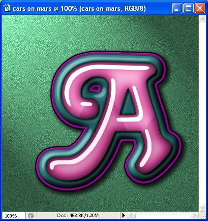
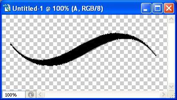
4. From the drop down box, find SK PS Tut Swirl. Set your font size to 75, and click once on the left of your canvas. You will see what looks like a very large blinking line. Type out a Capitol A, and hit enter when you have all of it showing on your canvas.

*Use your mover tool to position it near the middle of the canvas. (The mover tool is the second tool on the top left of the tool bar.)

*We have extra space all around, so let's crop it a bit. On the left, your crop tool is the first one in the third row. This is what you should have:

Photobucket

5. Next, go up to the Layer tab, then down to Type, then over to Convert to Shape.

* You'll notice that the edges of your shape get a little bit fuzzy like in the pic below:

Photobucket

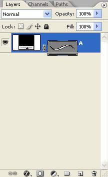
* Your layer palette should now have what's called a vector mask thumbnail on the right like this:

Photobucket

6. Now, go up to the Edit tab, then down to Define Custom Shape. The Shape Name box will pop up. Give your new shape a name and hit the OK button.

7. To save your shape, go up to the Edit tab, then down to Preset Manager. This box will pop up.

Photobucket

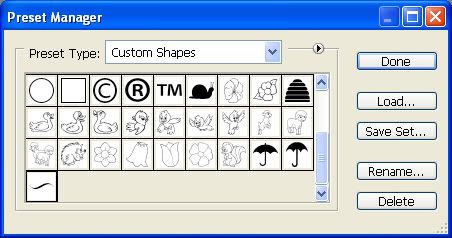
8. In the box beside Preset Type, find Custom Shapes and select it.

9. Click once on your shape you just made, then click the Save Set button, name your shape and save it to a folder on your PC. If you want to save more than one at a time, click once on the first one, hold down your Shift key and click once on the last one you want to save. Then click on the Save Set button, name it and save to a folder on your PC.

* Thank you Brandy and Bunny Rose for the back and forth emails on trying to figure out how to make shapes in PS :)
 
posted by Shawna at 8:37 PM | Permalink | 313 comments
Making Your Own Brushes From JPG/PNG ect.....
Supplies: my brush for tut.jpg which you can get Here

1. Open up brush for tut.jpg from the zip.

2. Go to the Edit tab, then down to Define Brush Preset.

3. From the box that pops up, give your brush a name and hit the OK button.

*You've made your brush. Pretty simple huh?

4. To save it, go to the Edit tab, then down to Preset Manager, and from there, click the arrow beside the Preset Type and find Brushes in the list.

5. Scroll down till you see the brush you just made, click it once, then click the Save Set button, and give your brush a name and hit OK. Save it to somewhere on your PC.

6. If you want to save more than one in a set, click once on the first brush, then hold down your Shift key, and click once on the last brush in the set. Click the Save Set button, name it and hit OK and save it on your PC.

* Thank you Bunny Rose for helping me out with this when I had no clue what I was doing :)
 
posted by Shawna at 8:34 PM | Permalink | 1 comments
Loading .abr Brush Files
Supplies: my butterfly.abr brush file which you can get Here


I previously made these same brushes available on my blog Here for PSP users, and at the time, I was just starting to learn how to use Photoshop, so I didn't make them as an .abr file for PS, but for the purpose of this tutorial, I've converted them for PS use.

I love photoshop brushes for the simple reason that the brush size limit is huge compared to paint shop pro. In PS CS2 and above, I'm pretty sure the size limit for brushes is 2,500 pixels in width and height, which is awesome for making background papers in my opinion.

Just a little piece of advice I received from fellow scrapper Linda on this. Make a folder in your PC somewhere named PS Brushes and store all that you download in that folder. Don't put them into the default PS folder. If you do, it will take forever for PS to load at start up. When you need a brush, just navigate to the folder you made to find them.

1. Click on your brush tool in the palette on the left and select Brush Tool.

2. In the tool bar at the top, click on the down arrow of the Brush Preset Picker.

Photobucket

3. This box will pop up, and click the arrow pointing to the right.

Photobucket

4. This next box will pop up and click on Reset Brushes.

Photobucket

* This will reset your brushes to just having the default PS brushes showing up.

5. Next, Go back up to the Brush Preset Picker, click on the arrow pointing to the right again, and this time from the flyout choose Load Brushes.

6. Navigate to where you saved my SK Butterflies 2008.abr file, click it once to highlight it then hit the Load button.

7. Go back to the Brush Preset Picker at the top and click the down arrow.

Photobucket

At the end of all the brushes, you should see all 14 butterfly brushes. Just double click on one of them, open up a transparent image and try it out.
 
posted by Shawna at 8:29 PM | Permalink | 3 comments
Layer Styles
Supplies: Christie font (optional, you can use one of your own) Get it Here.


Adding a premade layer style to an image is a quick and easy to way to get very nice effects like shadows, bevels and colour all in one shot. There are thousands of free layer styles available for photoshop users on the net. The best and biggest place I've found is Adobe Exchange. People upload the styles that they've created and they are free for you to download and use in your projects. I think you need to sign up before you are able to download anything, but it's worth it. In the next few tutorials, I'll show you some styles I've made for making great looking balloons and easter eggs, but first, let's take a look at how to load the default styles that come with Photoshop.

1. Start by opening up a 400 x 400 transparent image.

2. Type out a letter onto your canvas, any fat text will do, and you can use any colour, it doesn't matter.

3. Over on the right, you will see your Layer Styles box. Click on the Styles tab and you should see this:

Photobucket

* These are the PS default styles. Not very impressive stuff, but once you learn how styles work, you can download some fantastic ones from Adobe Exchange or make your own.

4. Click on the first style, and see how your text letter changes

Photobucket

* All of the effects that is used in creating that style has now been applied to your text letter. Take a look at the bottom of the palette. Click on the layer style button (the grey circle with the letter f in the middle).

Photobucket

* Drop shadow, bevel and emboss, gradient overlay and stroke all have a checkmark next to them. Those checkmarks indicate what effects were used in creating that particular layer style.

5. Click on Blending Options at the top. You'll see in the side panel on the left those same headings with the checkmarks in place. If you want to make any changes to any of them, just click on the section name. Click on OK when you are done.

6. If you want to revert back to your original text letter without any styles added, click once on the white square with the red line going through it.

Photobucket

* Next, we are going to load an .asl layer style file. You'll need to sign up to Adobe Exchange to download a practice layer style for this next part of the tut. So, go Here and sign up for an account.

* I have a folder named Downloaded Layer Styles on my PC and I put all styles that I've downloaded into there. I suggest you do the same.

* You can download any one of them to try out, but if you want to use the same one I am using, you can go Here and download Konst's Styles, and save the zip to your designated styles folder on your PC. Unzip it as well.

7. Click on the arrow pointing to the right, and from the drop down box choose Load Styles.

Photobucket

The Load box will pop up. Navigate to where you have saved the konst.asl file you downloaded from Adobe Exchange, ( or another one of your choosing) click on it to highlight it, then click the load button. In your styles palette, you will see all of the different styles you can choose.

Photobucket

8. Click on each of the layer styles to see how your letter looks with a style applied. Also, go down to the layer styles button at the bottom ( the grey circle with the letter f in the middle) and play around with some of the settings to get a feel of how you can change and create your own.

* That pretty much covers what layer styles do and how they can help you in creating and desigining your projects :)
 
posted by Shawna at 8:22 PM | Permalink | 0 comments
Using Actions
Supplies: Christie font (optional, you can use one of your own) Get it Download Here.

Actions for PS are pretty much the same as what scripts are for PSP. You just push play and they create a premade image for you. This tutorial will show you how to load and use actions that you download from the net.

For this tut, you need to download an action from Adobe Exchange and if you haven't already, you need to sign up for an account. So, go Here and register.

1. Open up a 400 by 400 transparent image.

2. Set your foreground to white, and click on your Text tool in the palette on the left. Choose a fat font, I'm going to be using the font called Christie, at a size of 75.

*I've included the font in the zip if you wish to use this same one.

3. Click once on your canvas with your cursor and type out a Capitol A. Don't use your mover tool to shift it over or the action will not work properly.

* Go Here to Adobe Exchange and download the action called Cars On Mars, and unzip it to a folder on your PC.

* If that link does not work, do a search in the Exchange for Cars on Mars.

4. In the Actions section on the right, click the arrow that is pointing to the right. From the flyout box, choose Load Actions, and find wherever you saved and unzipped Cars On Mars.atn.

Photobucket

5. Click it once to select it, then click on the Load button.

* It will appear in the Actions section on the right.

Photobucket

6. Next, click on the arrow next to the name of the action. A new section will appear below.

Photobucket

7. Click on the new name cars on mars. It should be highlighted in blue now like in the picture above.

8. Now, click on the Play button. See picture above.

* Some actions have specific instructions for you to follow in order for it to work properly. This one doesn't have any though.

9. Click on the Continue button when the creator information box pops up.

* It will only take about 30 seconds for the action to finish and when it's done, you should have this:

Photobucket

* The creator of this action has provided a background to make it look better, but you can delete it in the layer palette on the right.

* Some actions are made so that, when it's finished, you can change certain aspects of it such the drop shadow, or stroke, or bevel, but you can't do that with this one. It is what it is. You can check by clicking the Layer Styles button at the bottom of the layers palette ( grey circle with the letter f in the middle).

* You can do entire alpha's in one shot or just single images. And, you are not limited to using just text. Try using dingbats to create buttons or other random shapes.

Photobucket

Photobucket

Photobucket
 
posted by Shawna at 8:10 PM | Permalink | 3 comments
Colour Burn Your Edges
Photobucket


Supplies: sample image to work on Download Here.


1. Open up your Colour Burn Edges.png from the zip. In PSP, when we want to duplicate our image we use the Shift D key, in Photoshop we go to the Image tab, then to Duplicate, then just hit the OK button, and close out our original.

Next, we want to go to our Layer Styles options and the way to do that is to click on the the dark circle with the f in the middle of it. Right now, if you put your cursor over that little button, a circle with a line appears through it, and you are unable to get into your styles option. That's because you can't use layer styles on background layers. We need to make this a layer first. To do that, double click on the pink swatch thumbnail. When the New Layer box pops up, just hit OK. You'll notice it has turned from Background to Layer 0. Now we can use styles on it.

Photobucket

2. Click the circle with the f in the middle of it, then click on Blending Options, then click on Inner Shadow.

Photobucket


3. Change the Blend Mode to Colour Burn, and set the Distance to 0. Play with the Size and Opacity sliders and see how your pink polka dot swatch changes around it's edges. Make sure that Preview is checked on the right so you can view the changes in real time.

Photobucket
 
posted by Shawna at 8:00 PM | Permalink | 3 comments
Ric Rac
1. Open up a new transparent image about 200 pixels in height, and however long you wish your ric rac to be. I'm using 200h x 1000w for this tut.

2. Select your rectangular marquee tool, which is the first tool in the tool palette on the left. Make sure it is set to rectangle.

3. Draw out a long rectangle on your canvas.

4. Set your foreground to whatever colour you wish your ric rac to be. I'm using #77b26e.

5. Go up to the Edit tab, then down to Fill, in the Contents section, select Foreground and click OK.

Photobucket

*Your rectangle should now be filled with your chosen colour.

6. Go up to the Select tab, then to Deselect.

7. Now, to make the wave. Go up to the Filter tab, then to Distort, then down to Wave. Now, depending on how big or small you've made your rectangle, you may have to fiddle with these settings a bit. Change all your settings to the picture below:

Photobucket

I've cropped mine so it would fit on this page, but yours should come out to something like this:

Photobucket

8. Next, you can add some texture and a bevel. Go up to the Filter tab, then to Texture, then down to Texturizer and choose one of the many textures from there. You can also go to the bottom of the layer palette on the right and hit the circle with the letter f in it. Go to Bevel and Emboss and click on the word Texture on the left. Choose one from the flyout.

Photobucket
 
posted by Shawna at 7:45 PM | Permalink | 2 comments
Textures as Background Paper
Supplies: sample SK Texture. Get it Here


This tutorial will show you how to create a background paper from a texture found on the internet.

1. The texture I have provided in the zip is 1600 pixels wide by 1174 pixels high, so for the purpose of this tutorial, open up a transparent image with those dimensions.

2. Choose a colour for your background paper and set it as your foreground colour. I'm using #800000.

3. Go up to the Edit tab, then down to Fill, then choose foreground colour, and fill you transparent canvas.

Photobucket

4. Open up the sample texture from the zip.

5. Click on your Mover tool, and place your cursor directly on the sample texture itself, and drag it over to your colour filled canvas. Move it into place if needed.

Photobucket

* Your greyscaled texture should be on top of your colour layer. Now we are going to change the Blend Mode. Make sure your texture layer is highlighted in the layer palette.

6. Click on the down arrow beside the word Normal, and choose one of the many blend modes. Overlay, soft light, screen and multiply are the ones that I use the most, but try them all to see how they look. You will get different results depending on whether you've chosen a dark or light colour.

Photobucket

* You can also play with the Opacity and Fill layer sliders to achieve different looks. When you find something that you like, go up to the Layer tab, and Merge Visable. Here's a few examples of different blend modes:


Photobucket

Photobucket

Photobucket
 
posted by Shawna at 7:31 PM | Permalink | 1 comments
Torn Paper
Supplies: textured paper sample, and my torn paper brush, which you can get both of these Here


1. Start by opening up SK Blue for Tut.png from the zip.

2. Create a new layer over this one. Go up to the Layer tab, choose New, then Layer and click OK.

3. Set your foreground to whatever colour you want as your tear. I will be using a very pale blue #e3edf9.

4. Click on your brush tool and click the down arrow on the brush preset picker at the top. From the flyout click on the arrow that is pointing to the right like in the picture below:

Photobucket

5. A box will pop up, choose Load Brushes. Navigate to where you have saved my SK Rough Edges of Brush.abr brush and click it once to highlight it, then click the Load button.

Photobucket

6. Scroll down to the end of the brushes and double click on SK Rough Edges of Square to select that brush.

Photobucket

* You'll notice that the brush size is 17 pixels. If you want it smaller, just use the slider.

7. Make sure your blank layer is the active layer ( it should be highlighted blue, if it isn't just click it one time) Starting at the top right hand corner, move your cursor downward to make your paper tear line.

Photobucket

* Be sure to start at the very top, and end at the very bottom, leaving no spaces.

8. Working on Layer 1, next, select your magic wand tool from the left, ( it is the second icon in the second row) and click once on the part of the paper that we want to delete. I have my tolerance set to 20, anti-alias and contiguous is checked.

Photobucket

9. Click once on the blue paper layer in the layer palette, then hit your delete key on your keyboard. The unwanted section should now be deleted.

Photobucket

* Now we need to put a little bit of a texture on it.

10. In the layer palette to the right, click once on Layer 1 to make it our active layer. Next, go up to the Filter tab at the top, then down to texture, then to texturizer. Use these settings, or choose one of your own:

Photobucket

11. In the layer palette on the right, drag and move Layer 1 down below your blue paper layer. You may need to select your mover tool first, and push the torn line on your canvas over to the right a bit before moving that layer below the blue paper, or its going to disappear completely behind the blue paper layer.

12. You can give your torn line a slight bevel if you wish as well. With your torn line layer selected, in the layer palette on the right, down at the bottom you will see a circle icon with the letter f in the middle. Click on that, then select Bevel and Emboss. Leave everything at it's default but change the Depth to anywhere from 1 to 12 and hit OK. I chose 11.

Photobucket

13. Still working on your torn line layer (layer 1), use your mover tool and place it into whatever position you think looks good. I've placed a green background on mine so you can see how mine turned out so far. *Tip: You can use your arrows on your keyboard to nudge your torn line into place a little bit at a time.

Photobucket

14. You can also use your eraser tool to soften the edges of your blue paper line where it meets the torn edge. Just select a soft round brush and set the opacity to something very low like 15 to 18 percent. Click on your blue paper layer to make it active, and start erasing the edge to help it blend in with the new torn edge.

15. When you are satisfied with how it looks, go up the the Layer tab and then down to Merge Visable.

16. Give it a drop shadow as well. Click once on the circle with the letter f in it at the bottom of the layer palette and choose drop shadow. These are the settings that I used:

Photobucket

And here is my final result:

Photobucket
 
posted by Shawna at 7:05 PM | Permalink | 0 comments
Balloons with Layer Styles
Now that you know what layer styles are and how they work, I'm going to show you how to make a few different kinds of balloons with my custom shapes and styles that I've made myself. You need my balloon custom shapes for this, which you can get from my blog Here
You will also need my balloon layer styles which you can get Here.


1. Start by opening a 400 x 800 transparent image. Photoshop has probably automatically shrunk the viewing percentage down to 66.67%. If you look in the bottom left corner of your canvas, backspace out the numbers and type in 100%, hit enter, and drag one of the bottom corners out. It's much easier to see at full size.

2. Click on your custom shapes button on the left. Then go up to the tool bar at the top and click the down arrow beside the word shape.

3. From that flyout, click the small arrow pointing to the right, and from that flyout choose Load Shapes. Find where you downloaded my SK Balloons 2008.csh file and click it once to select it, then click on the Load button. All of the balloon shapes should now be visable.

Photobucket

4. Click on the third round balloon.

5. Set your foreground to white, hold down your Shift key and draw out the shape on your canvas. Use your mover tool to reposition it if needed.

6. Next, go over to the Layer Styles box on the right. Click the arrow pointing to the right, and select Reset Styles. A box will pop up asking Replace Current Styles with Default Styles? Click Yes.

* You should always reset your styles before loading any others so you don't get confused as to what is in there, and the styles box doesn't get all cluttered up.

7. Go back to the styles box, click the arrow again, this time choose Load Styles. Find the one called SK Regular Balloon.asl and click Load.

8. Click the dark pink square that is now in your styles box and your balloon will change to a solid pink.

Photobucket

* You can change the colour by clicking on the layer styles button at the bottom of the layer palette ( grey circle with the letter f in it). Click on colour overlay and just click on the dark pink box and choose a different colour.

* You can also change or delete the drop shadow by taking the check mark out of the drop shadow box to delete it completely or by just changing the size or opacity of the shadow.

9. Let's try another style. In the Styles box, click on the white square with the red line going through it. That will bring your balloon back to having no styles attached to it. Repeat the process of loading a new style and choose SK Regular Latex Balloon2.asl. With this one, if you wish to change the colour, you need to change 3 different settings; colour overlay, inner glow, and inner shadow. Fiddle around with those settings and see what you can come up with.

Photobucket

10. Clear that style with the white circle and red line and now open up SK Transparent Balloon.asl. This one is is a little more see through than the others. To change the colour, you need to change the stroke colour as well as satin colour.

Photobucket

* You can also add patterns to your layer styles to make designs on your balloons.

Photobucket


Go Here to learn how to use patterns on shapes.
 
posted by Shawna at 6:57 PM | Permalink | 5 comments